
PROJECT
BombBomb Video Page
The video tab is a crucial aspect of BombBomb, as video content is a primary feature of the platform. It serves as a comprehensive library for both personal and shared videos. The video tab is the most frequently accessed section of the web app and receives the highest amount of user traffic. However, it is also an area that requires continual improvement and refinement based on user feedback.

The Problem
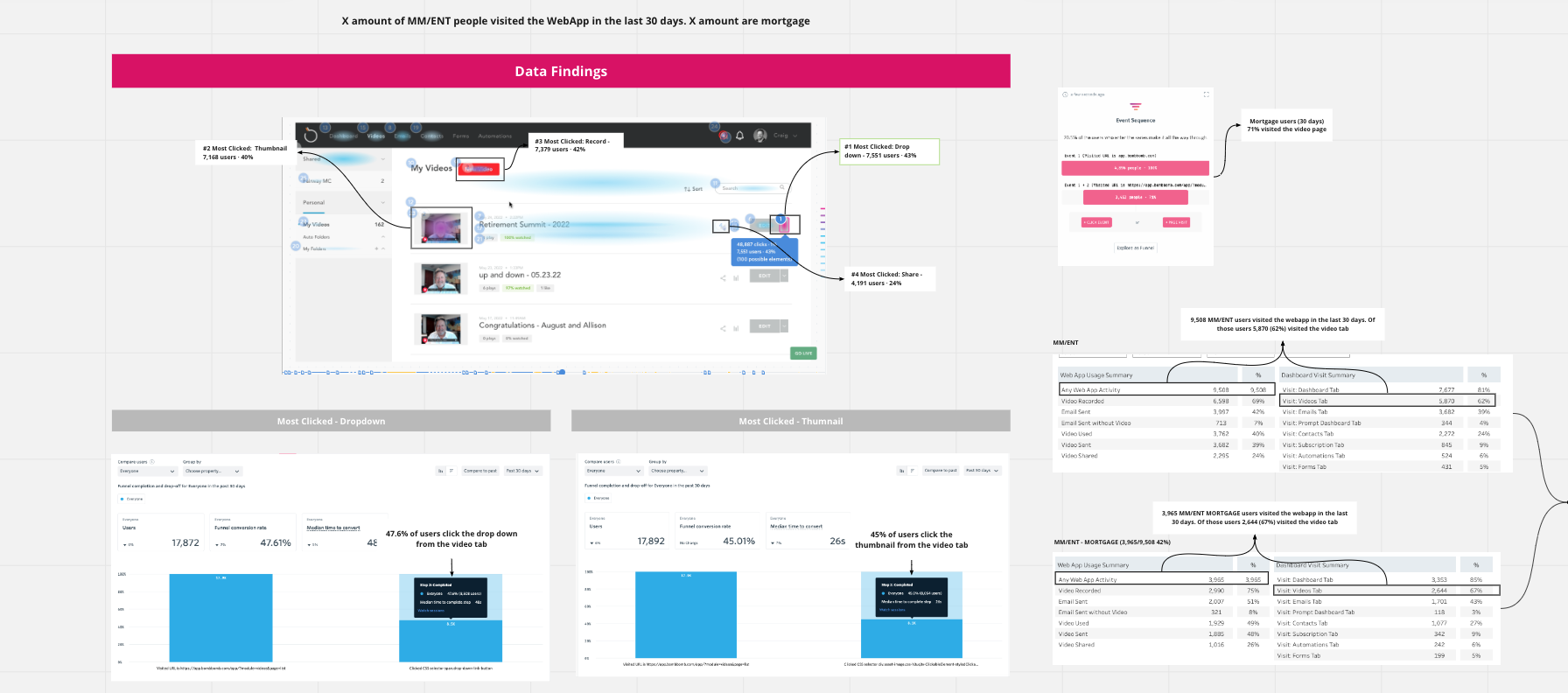
The User Problem: Based on recent data as of Oct 28, it appears that the video tab is the most popular area among Mortgage/Finance users, with 66% of them accessing it in the last 30 days. However, our core users are facing difficulties in locating and sharing the videos that hold the most significance for them and their recipients. Therefore, our goal is to address these two primary issues in order to enhance sender engagement.
Outcome: With a more modern and flexible UI, users can more easily find and share their videos whether they are in a Shared folder location or their own Video Library.
Team + Role
My team was tasked with tackling this problem, with me playing the role of both researcher and UX/ UI designer with close collaboration with Product Management, Development, and the Senior Leadership Team.
The Original Experience

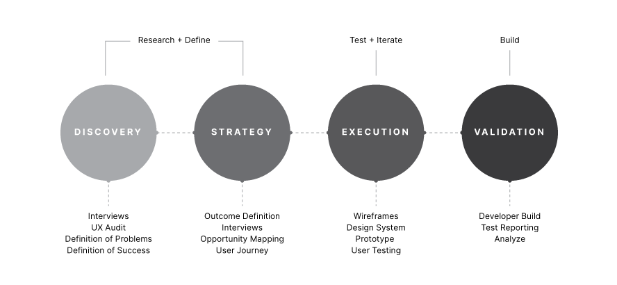
The Process
To begin with, we conducted thorough research to understand our users and business goals. This involved delving into data, analyzing competitors, interviewing clients, and mapping out user journeys. Our aim was not only to pinpoint key issues from both a business and user standpoint but also to determine the optimal first solution to roll out to our users.
Following our initial research, we dedicated two sprints to whiteboarding potential flows on our walls. We continuously critiqued and discussed these ideas with key stakeholders and customers. Next, we transformed these high-level sketches into interactive prototypes using Adobe XD. This allowed us to not only envision the ideal experience but also test it with stakeholders and customers to gain a better understanding of the product in action.
With lots of constructive feedback along the way, I collaborated and reviewed with the development team to launch a final solution for our users in testable increments.
Data Research
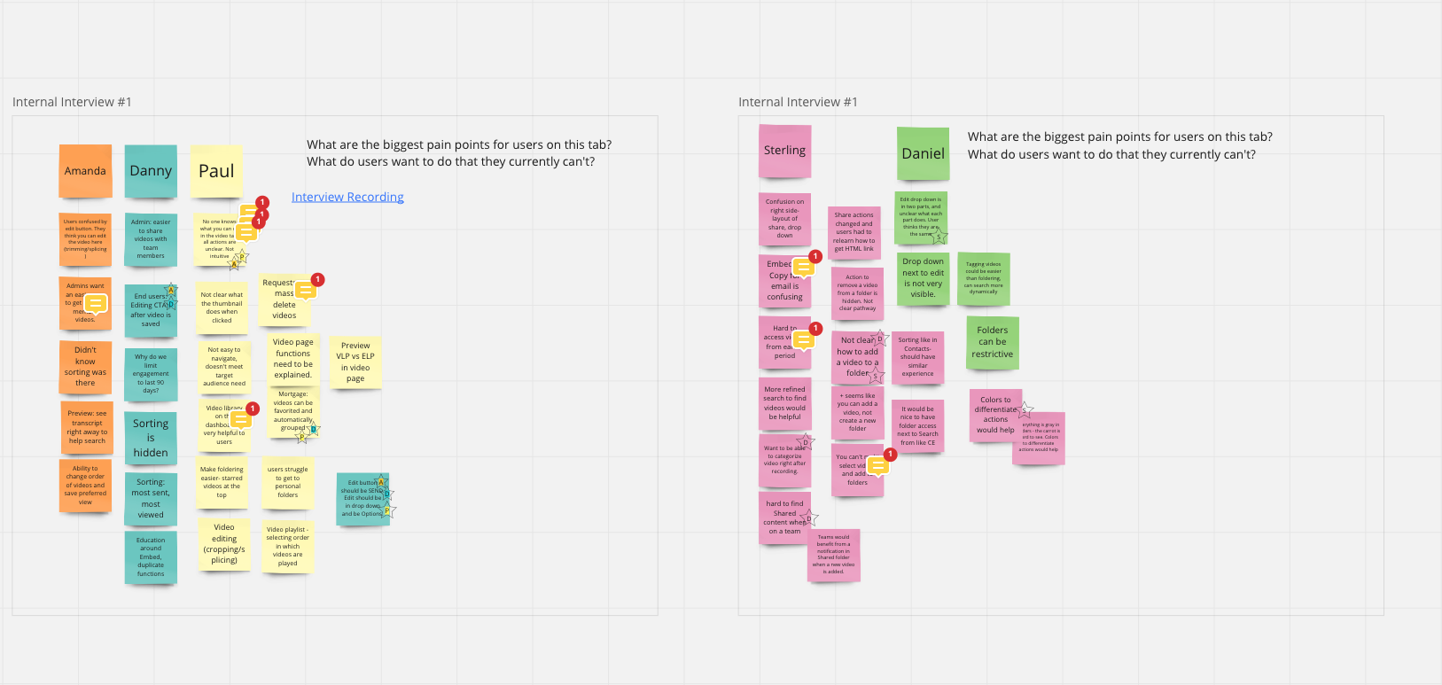
Stakeholder/User Interviews
Ideation/Testing
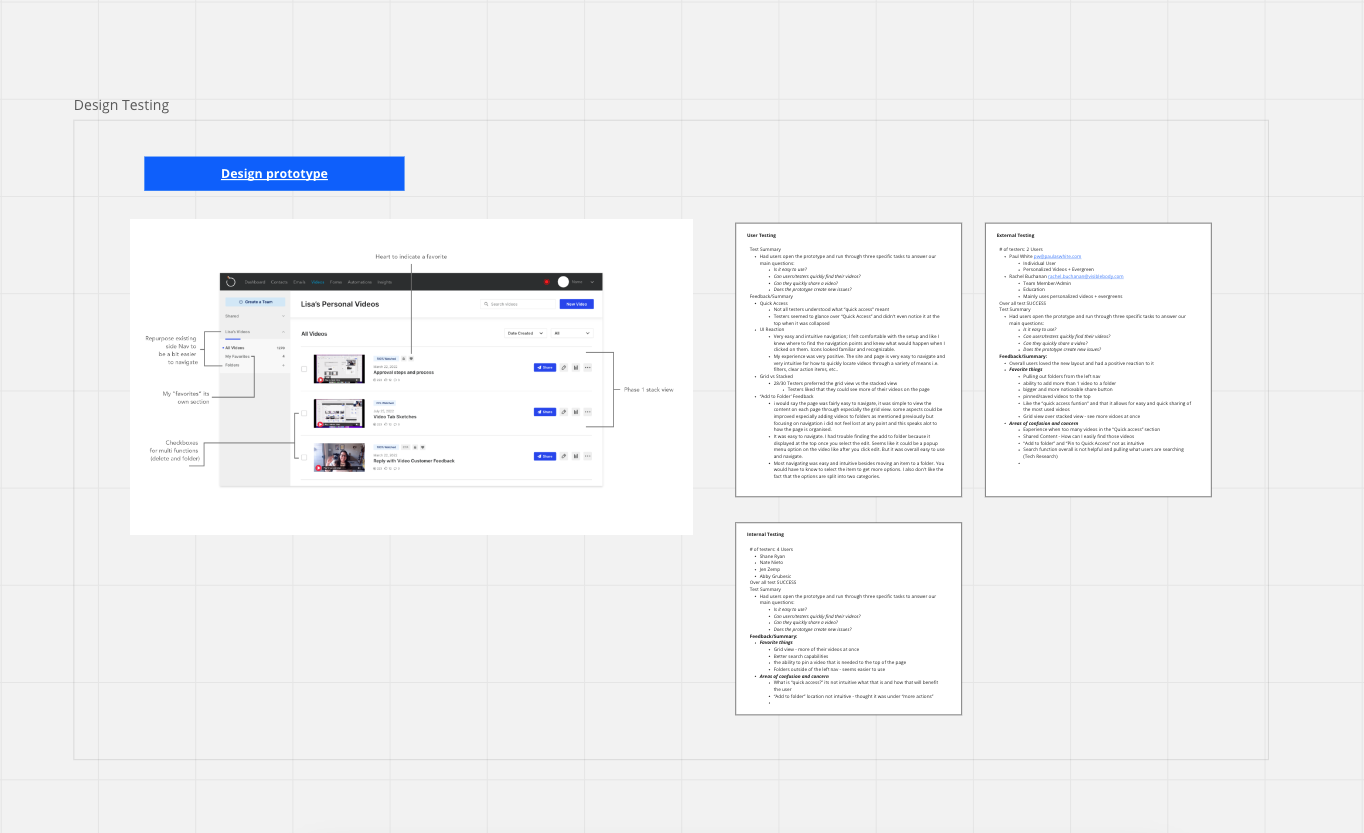
The Final Solution
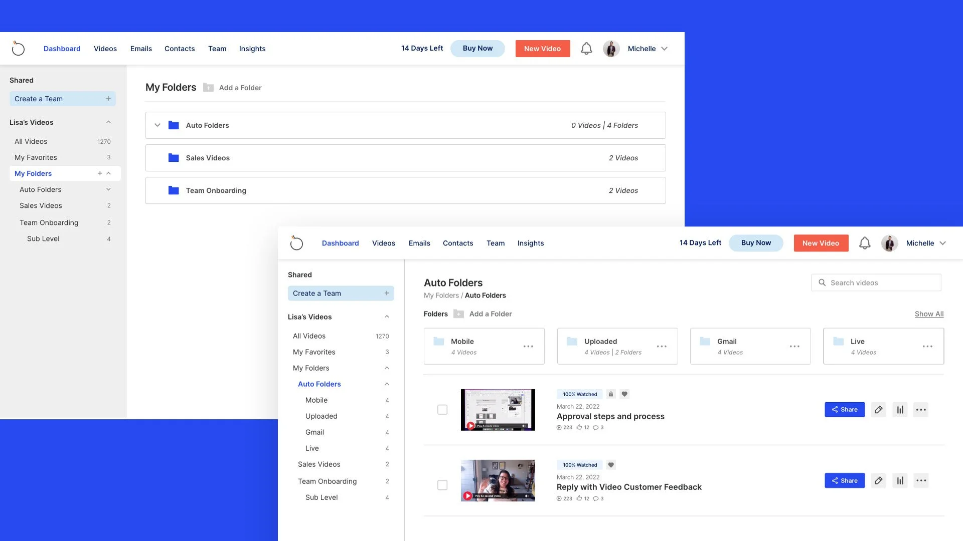
Our ultimate objective was not only to address the fundamental issues of video sharing and management but also to enhance the user experience by implementing an updated branding UI to tackle minor usability concerns. Our latest solution provides users with a convenient means of organizing videos using accessible folders, multi-selection for sharing and deleting, and simpler access to personal and shared videos. Additionally, we introduced a new feature called "my favorites" which allows users to conveniently save their frequently viewed videos for easy access.

Quickly Share Videos
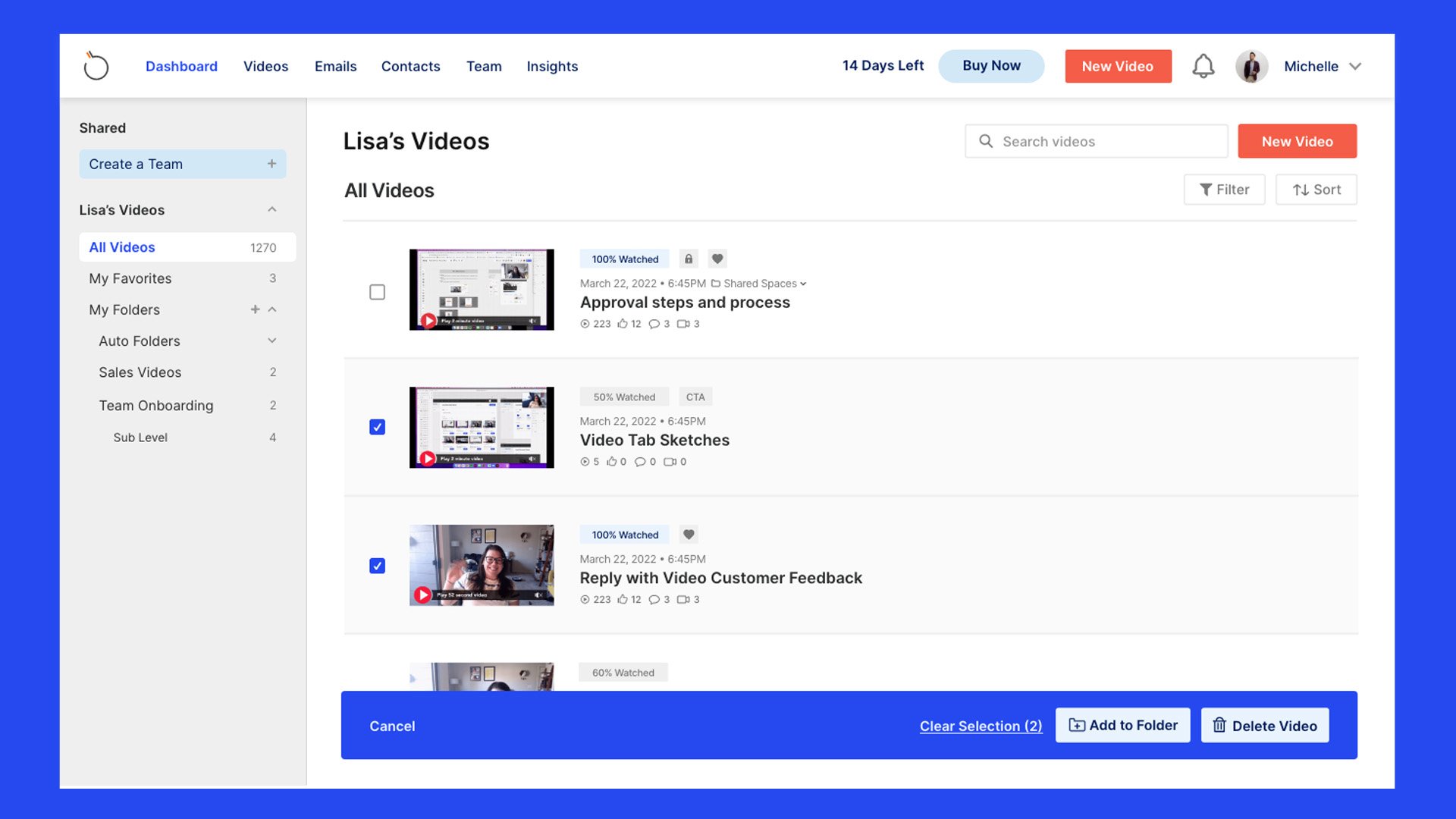
The updated designs now feature a more prominently displayed share button, making it easier for users to quickly share their videos.
Video + Folder Organization
Users can now conveniently access and organize their videos by adding them to premade or customized folders using the new folders tab.
Multi-Select Options
Users frequently requested the ability to delete multiple videos simultaneously, which has been implemented in the new design. Now users can easily select and delete multiple videos at once and organize their content more efficiently.
WAS IT A SUCCESS?
Final Results + Metrics
The prototype received positive feedback during testing from internal stakeholders and core user groups. They expressed enthusiasm and mentioned that it has resolved their core issue, making it simpler for them to access and share the videos they require the most. The feature is currently in Beta, being tested by a group of 30 users, and the plan is to launch it in late spring.